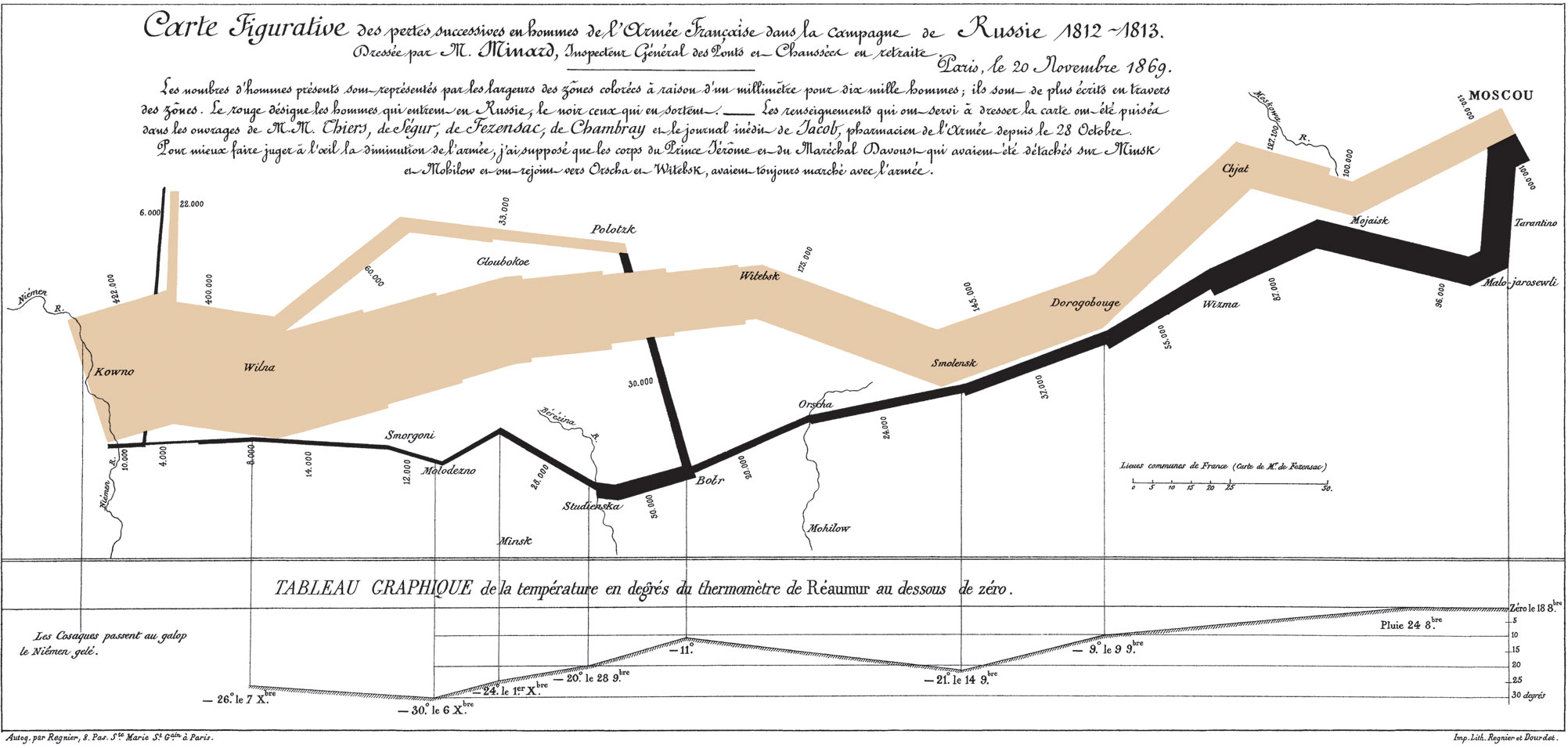
Minard’s map of Napoleon’s 1812 Russian campaign, showing the size of the advancing army above, the retreating army below.
We can think of technical communication as one large, continuously developing field, and information design as a related discipline or additional skill made up of graphic design, human factors design, and writing.
Famous examples of information design take us back to Florence Nightingale’s Diagram of the Causes of Mortality and Charles Minard’s Carte figurative depicting Napoleon’s disastrous march on Moscow in 1812 (see above).
For further insight into the information designer’s world, see Edward Tufte’s The Visual Display of Quantitative Information, deemed a “visual Strunk and White” by The Boston Globe. Tufte himself has been described as the “Leonardo da Vinci of data” by The New York Times. Tufte set out to prove how best to visually display data for swift and easy analysis, simultaneously setting the bar on how to make the world just a little bit clearer.
Sometimes an image is best, with its ability to perform a multitude of tasks in one fell swoop by describing, contrasting, summarizing, adding detail, highlighting change, and drawing comparisons.
The tech comm blog I’d Rather Be Writing draws some interesting conclusions by attempting to differentiate instructional design from technical writing. Author Tom Johnson observes that people learn through visual illustrations. No matter how well written, a how-to manual may get left by the wayside. Despite being two separate disciplines, technical writing and information design ultimately rely on each other for user success.
Duties
Information designers are known to blend their skills in technical writing with expertise from previous career paths and specialties, in areas as diverse as computer programming, graphic design, usability testing, marketing, project management, and communications.
Information designers may find themselves being asked to:
- Identify and analyze relevant content, audience, purpose, end goals.
- Create and organize summaries, references, topics, procedures, glossaries.
- Consider and format layout, typography, headings, photos, screenshots, white space.
- Produce and incorporate charts, graphs, tables, flowcharts, diagrams, wayfinding tools.
A day in the life of an information designer might look something like this:
- Identify project constraints and needs.
- Discern task specifications.
- Verify data sets.
- Make design selections.
- Implement documentation plans.
- Test and monitor content.
- Create information solutions.
- Analyze results and consult other team members.
End products might include:
- Instructions
- Training manuals
- Data visualization diagrams
- Online help
- Web and mobile applications
- User guides
- Brochures
- Labels
Tools and techniques
It all boils down to efficiency, efficacy, and simplicity. Information designers also employ the following four basic design principles:
- Proximity
- Alignment
- Repetition
- Contrast
Job prospects
Canadian industry predictions are difficult to find, because Service Canada still references statistics in terms of graphic design only. The School of Professional Studies at Northwestern University offers an American perspective, predicting strong expected job growth within digital media, digital design, and customer relations management with a 16% to 21% increase by 2020 for communication specialists.
Becoming an information designer
Consider using and combining different backgrounds and skills — mathematics, statistics, psychology, research, graphic communications, art history — with technical communication. Active listening and user interface testing experience also help.
Online, you’ll come across options such as Alberta’s Mount Royal University Bachelor of Communications in Information Design, and the Research, Analysis, and Information Design course in the Continuing Studies program at Simon Fraser University. Professional diploma programs can also be useful education options.
Recommended reading:
Design staple: Edward Tufte, The Visual Display of Quantitative Information
Student for a day: David A. Lauer and Stephen Pentak, Design Basics
Blog: Vancouver-based user-experience designer and usability analyst Jerome Ryckborst’s blog Five Sketches currently features VCC Technical Writing students’ top picks for favourite blogs and websites on the subject.
Megan Alford has a certificate in Technical and Business Writing from Vancouver Community College, is a graduate of the Office Administration with Technology Program from BCIT, and has a Major in Creative Writing and a Minor in English Literature from Concordia University. She’s currently program assistant for BCIT’s Technology Management program.