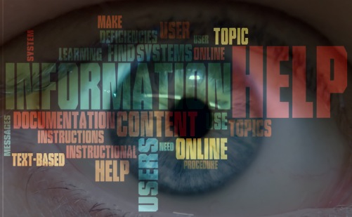
Recently, I was tasked with critiquing a company’s online help system, commenting on deficiencies in its current documentation, and providing feedback on all aspects of user assistance. I also needed to rework existing content. This was a valuable exercise, as I was able to:
- learn more about the company’s products
- identify weaknesses in its online help system
- strategize ways to improve documentation
To help me get started, I looked at the best practices for creating online help systems, including common deficiencies in documentation and strategies for improving user experience.
Common Deficiencies in Documentation
Common deficiencies in online help systems include:
- Topics that are buried or unorganized
- Conceptual information mixed with instructional information
- Few instances of context-sensitive help
- Excessive bolding of terminology
- Inconsistent formatting of headings and subheadings
- Absence of a glossary and/or index
- Lack of visuals, diagrams, and screenshots to complement or enhance text-based instructions
- Grammatical errors
Strategies for Improving User Experience
User experience can be improved by focusing on four aspects of user assistance: content, navigation, formatting, and integration with learning.
Content
- Be concise: Keep procedure steps short and sweet, and present topics in brief, task-oriented modules of information.
- Be clear: Make your content easy to understand. Use plain language, and avoid distracting your readers with too much detail.
- Organize your content: Separate conceptual information from instructional information. Avoid burying topics too deep—your user won’t find them!
Navigation
- Make help context-sensitive: Enable users to easily find related topics based on their specific location. This allows for multiple entry points and accommodates different levels of knowledge.
- Use specific topic names: Specificity is key in naming help topics. Users should be able to determine what information they will find based on the name of the help topic.
- Make content search-friendly: Include a glossary and an embedded index. Help users find terms and definitions efficiently.
Formatting
- Add visual appeal: Screenshots and diagrams help break up text-based instructions and make information easier to scan. Crop images to show only the part that is relevant.
- Highlight important messages: Use icons to highlight messages such as “Important” or “Note.” This will help spotlight this information and separate it from procedure steps.
Integration with Learning
- Know your audience: Find out what your users struggle with, what information they need, and what tasks they perform frequently. Use help desks and training to help build content that users need.
- State learning objectives: Explicitly list learning objectives for each topic to help focus users and enable them to identify the information available in a specified help topic.
- Watch and learn: Include instructional videos to allow users to access information without relying solely on text-based instructions.
Resources
Michelle Corbin’s article “Design Checklists for Online Help” outlines design attributes of online help systems.
Matthew Ellison’s article “Seven Golden Rules of Online Help Design” provides strategies for building better help systems.
Cherryleaf’s “Tips for Writing Great Technical Documents and Help Files” offers insight on creating quality documentation.