Style guides are critical to our work as writers. They tell us how to spell words (Canadian or US?), how to hyphenate (email or e-mail?), how to punctuate (serial comma: yes or no?), how to capitalize (internet or Internet?), and how to write step-by-step procedures (is it “Click Enter” or “Select Enter”?). They lay out rules and guidelines for voice and style, tone and attitude.
The goal is consistency. The larger the organization, the greater the need for a style guide to keep all the writers on the same page, so to speak. Newspapers, magazines and websites live and die by their style guides – and their editors edit obsessively, with one eye on the guide, and the other eye on accuracy, clarity and correct expression.
As tech writers, we need style guides as much as the Globe and Mail and cbc.ca do.
So what do you do if you arrive in a new job and there’s no style guide? Easy. You create one.
If you’re working for a software or other hi-tech company, you might try a two-step approach:
- Select an authoritative guide like the Microsoft Manual of Style to set overall standards and guidelines for all your documentation.
- Then create a company-specific summary of those standards and guidelines, with any exceptions or modifications that you (and management) think are appropriate. You can publish your summary as a PDF on the company intranet so everyone can view it.
I like to create an online version, using a web tool like Confluence or Sharepoint, so people can bookmark appropriate pages. The easier it is to access, the more likely the style guide will be used.
For a recent software client I put together an online style guide divided into the following six sections:
Style guide do’s and don’ts
This is an alphabetical listing of all the key rules and guidelines. You might have two or three dozen items in this section.
Under A for Acronyms, for example, you might write: “Spell out the terms the first time they are used followed by the acronym in parentheses. Use the acronym for all subsequent references.” In the “Do” column, you give the correct first reference, e.g., “Electronic Health Record (EHR)”, and in the “Don’t” column you give the incorrect first reference, e.g., “EHR”.
Or under G for Gender, you might write: “All instructions and procedures should be gender neutral. Use you, they, their rather than he, she, his, her,his/her. Or recast the sentence using plural.” In the “Do” column, give a correct example, e.g., “Each user should remember their password.” In the “Don’t” column, give an incorrect example, e.g., “Each user should remember his password.”
Spelling
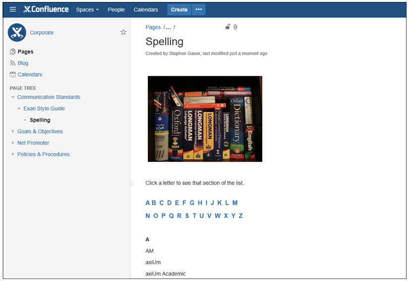
In the spelling section, I like to create a long web page, with difficult or tricky words grouped by letter, from A to Z. At the top of the page I put the 26 letters of the alphabet, then I create hyperlinks to take users from a letter down to that section with one click.
Here’s an example:

Your spelling section should also specify whether you’re using Canadian or American spelling, and which dictionary will rule. I usually push for the Canadian Oxford dictionary, but many software companies, especially those with major US clients, insist on American spelling. Merriam Webster is a good American choice.
Good writing
This section can contain some tips for good writing. I like to repeat my mantra of “simplicity, clarity, and brevity”.
For example:
Brevity: eliminate unnecessary words. “Daily” means exactly the same thing as “on a daily basis” and eliminates three words. Avoid unnecessary words if your audience is not highly technical. Do they need to know it’s a “load balanced, twin-duplexed, ultra super duper file server” or is it just as accurate to say “server”?
Step-by-step procedures
It’s crucial to document and give examples of how step-by-step procedures should be written and formatted so everyone in the company who writes procedures follows the same style. You may be editing someone else’s draft procedures for a document or client communication; it saves a lot of time if you can focus on content rather than have to rework the style, numbering, and formatting.
Basic typography
Provide some pointers on using font sizes correctly, creating white space in a document, customizing defaults like leading and line length, and controlling paragraph space before and after. This helps keep your own work consistent and helps other people in the organization improve the appearance of their documents.
Document naming conventions
Some companies are very specific about how documents are named. If there are rules, put them in the style guide.
Style guides don’t teach people how to become better writers. But by setting standards and offering guidelines, they create a context and environment where good writing can flourish and where readers won’t have to puzzle through irritating inconsistencies like “email” and “e-mail” used in the same paragraph.
Related articles
Book Review of the Global English Style Guide, by Serena Beck


Great article. I love the alphabet idea.
Good article, Stephen!
Stephen,
Nice article with good ideas. For me, I find the challenge is not in alphabetizing style guide content but more about clearly stating the desired emendation. What’s wrong, how should it be corrected, perhaps an example to clarify the point, and a citation showing where and how the rule was devised.
Jason