Typography is the art and craft of arranging text on the page and screen for maximum legibility and comprehension.
The world of typography changed forever when Jan Tschichold published The New Typography in 1928. Tschichold was part of the 1920s Bauhaus movement in Modernist design that radically changed our ideas about architecture, graphic design, product design, and typography.
Our technical documents and user guides still bear Tschichold’s imprint to a greater or less degree – asymmetrical layouts, sans serif typefaces, careful attention to alignment, and generous use of white space.
We may not be aware of it, but every time we create a Word document we’re making typographic decisions – even if that only involves accepting Word’s default settings for things like line length, leading, and paragraph spacing.
With a little care and attention, though, we can improve the typography of our Word documents, and therefore make them easier to read.
Here are some typographic considerations and the Word features that control them.
Line length
A good range for readable body text (the paragraphs of your document, as opposed to the headings) is 50 to 75 characters. Word 2016’s default line length is about 105 characters, if our document is set to Calibri, 11 pt, or Times, 11 pt., with standard margins. If we change to Arial 11 pt, the line length shrinks to 86 characters.
We have several options if the line length is a little too long. We can set a larger point size (e.g., increase it from 11 to 12 points), increase the margins left and right, or move to an asymmetrical layout by indenting all text one to two inches from the left.
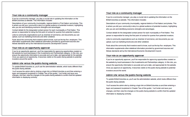
Here’s a traditional asymmetric layout for a user guide:
And yes, the document will be longer. But if our goal is legibility and comprehension for our readers, it’s a price worth paying.
Leading
Leading is the space between the lines. In traditional print typography, leading is expressed by two numbers. The first number is the point size, the second number is the point size plus the amount of space between the lines. So leading of 11/14 means the body text is 11 pt, and the space between lines is 3 points. Increasing the space between lines can have a dramatic effect on legibility.
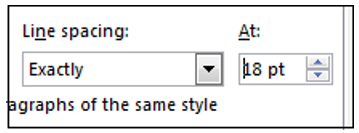
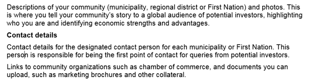
Here’s is Word’s default setting with Arial 11 point text (11/12) on the left, and increased leading of 11/18 on the right:
You can change leading in Word by selecting the text, and then in the Paragraph dialog box, change the Line Spacing setting to the sum of the body text and the leading amount. In this example, 18 pt:
If you know how to edit the Normal style, you can change the line spacing setting there, and it’s applied to all Normal text in the document.
Spacing before and after paragraphs
By default in Word 2016, the space before every paragraph is 0 and the space after every paragraph is 8 pt. This eliminates the need to press Enter twice between paragraphs. I usually reset this to 0 before and 6 points after, but the default setting is fine too. This setting is also controlled in the Paragraph dialog box.
Spacing before and after headings
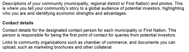
Main and subheadings should be closer to the paragraph following the heading than the paragraph preceding the heading. If you don’t set the spacing this correctly, the heading appears to float in the space between the paragraphs. In the following example, the heading “Contact details” has six points before and six points after.
We can edit the heading style so it’s 12 before and 6 after, and then the heading moves down just enough to be visually connected with the paragraph that follows it:
Font sizes
In traditional print typography, graphic designers selected font sizes from a fixed set of sizes. Body type was typically 10, 11 or 12 point. Display type for headings and subheadings was 14, 18, 24, 30, 36, 42, 48 or 60 pt. These are not arbitrary numbers. They evolved over time (centuries in fact) and became standard sizes because they looked good on the page.
The computer lets us set any point size we want, including fractions. This isn’t necessarily a bad thing, but it can wreck the relationship between font sizes on the page, making some headings seem too large and others too small. Try working with the standard sizes.
A few comments on typefaces
The traditional rule of using a maximum of two typefaces per document still makes sense, although most technical documents these days use only one – typically Arial, Helvetica or Calibri.
These are sans serif typefaces that work well on the printed page and the screen. Helvetica dates from the 1950s and is the most popular typeface in the world. Arial appeared in 1982 as a less expensive version of Helvetica. Calibri, which first appeared in Microsoft Office in 2007, is the current default in Word, and has a wider, more open look than Helvetica and Arial. It’s an excellent choice for PDFs, web pages, and online help systems built with Robohelp or Madcap Flare.
Sans serif means “without serifs” – serifs are the decorative bits at the edges of letters like the capital A and T. Popular serif typefaces are Times Roman, Baskerville, and Garamond. These traditional typefaces are commonly used in newspapers, magazines and books, and are based on Roman letter shapes from the 1st century AD.

Stephen is a senior technical writer with more than 20 years experience writing for corporate and hi-tech clients in Vancouver and Toronto. He is the past president of the STC Canada West Coast chapter.