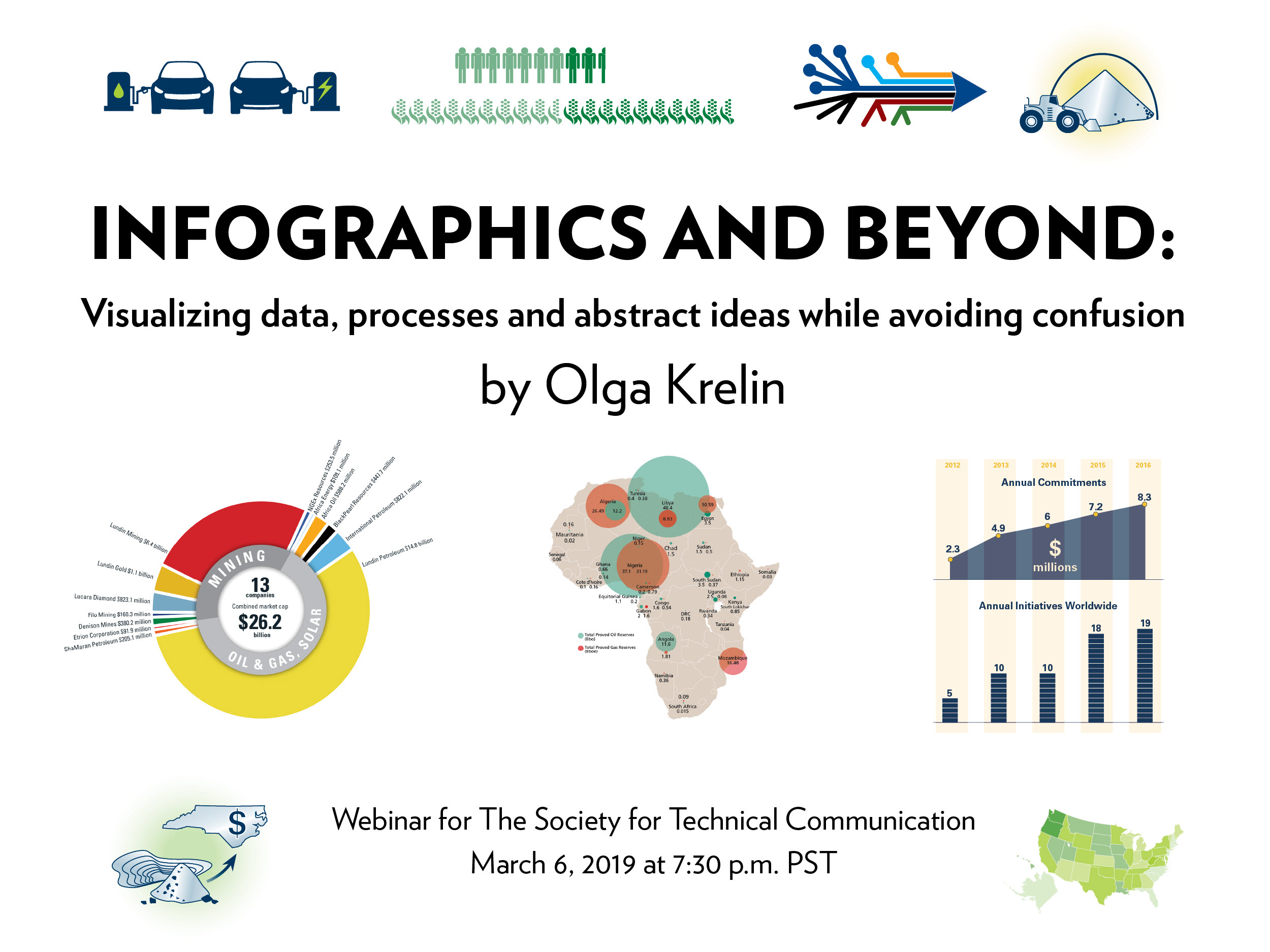
 On March 6, 2019, graphic designer Olga Krelin presented an excellent hour-long webinar titled “Infographics and beyond: visualizing data, processes, and abstract ideas while avoiding confusion.” Olga has many years of experience, including an Industrial Design degree.
Visualizing Data
Putting information into a visual form is an emerging area and is quite trendy right now. Visual data excels at getting the correct data to an audience who use social media and want short, precise ways of evaluating information.
Many people think of infographics as simple charts, graphs, and cute illustrations, but the work involves information design and encompasses a wide range of ways to convey information. Information design can be separated into two main areas: quantitative visualization and concept visualization.
For either area, it is best to start with a question and answer that question You can have multiple questions and answers in one infographic.
Quantitative Visualization
Quantitative visualization usually answers the question “how much?” It requires hard data.
One common example is a bar chart, which is very flexible, easy to make, and good for technical audiences, but it can have variables that are hard to match up. Block charts are a type of bar chart and are a good way to show extreme variations.
A pie chart uses pullouts to show smaller amounts very well.
Bubble charts (similar to block charts) are a more vibrant and creative option but are also more complex.
Progression over time is a good way to show numbers over a specific period. You can use colours to show variables, either similar (using similar colours) or competing (using disparate colours).
Geo-mapping data is useful because some people prefer images over text, and it makes the chart more engaging.
Olga also introduced the concept of “chartjunk”: the use of too much material on the chart, resulting in a misleading or ineffective infographic. For example, using 3-D effects is not encouraged, especially when producing a pie chart, because it alters perception; the pieces look smaller or larger while still being the same percentage of the chart.
Edward Tufte, a well-known author on data visualization, defined chartjunk as “interior decoration of graphics … which does not tell the viewer anything new…. it is all non-data ink or redundant data ink.”
Olga also recommended not using legends on charts. They’re not user friendly; they force the user to hunt for something in the graphic instead of showing the information clearly and simply. We need to eliminate chartjunk and make graphics as clear as possible, rather than cluttered or confusing.
Concept Visualization
Concept visualization usually answers the questions “why?” or “what?” or “when?”, questions such as: Why would we invest in you? Why are we better than our competitors?
Showing a concept is an easy way to help users process information. For more abstract projects, concept visualization can display data beyond simple numbers.
Concept visualization sometimes uses numbers, but they are not the focus of the graphic. It is more about showing a trend, a process, progress, or performance.
Concept visualization is a good way to show influence, especially when trying to create a positive spin for the client, such as tracking the evolution of a concept or product.
If you have a project with large amounts of data, you can use infographics to easily compress it down to the essentials, and still give the same answer your client wants. If you have very little usable data, you can filter what you have into visuals to reinforce the desired answer.
Clarity is very important when presenting information visually, and it can be very difficult to take confusing information and turn it into a simple result that the client wants to achieve.
Summary
Information design is all about distilling the essential information into your infographic and organizing it in the clearest way possible. It can be challenging, but also very rewarding when done correctly.

A technical writer with over 25 years experience in aerospace, health care, banking, food, & horticulture. He is a Senior Specialist, Org Knowledge for Argus Controls in Surrey, BC
